
Have you ever noticed how certain colours make you feel a certain way? In the realm of interior design, colour isn't merely a decorative element; it's a powerful tool that can influence our mood, perception, and even our behaviour. Different colours trigger different emotional responses, because of the meanings we associate with them. They can bring feelings of joy, serenity, or even anxiety, which is why they’re so important in shaping the vibe of a room. From calming blues to energizing yellows, each hue carries its own unique psychological impact, and understanding these effects is key to designing a home that feels just right for you.
Specific Colour Breakdown
Green

Pictured: Rhea Dining and Ivydale Bedroom
Blue

Pictured: Charlton Dining and Hudson Bedroom
Blue has a soothing effect on the mind and can help reduce stress levels. It is known to promote relaxation and tranquillity, making it perfect for bedrooms and bathrooms where unwinding is essential. Light blues are particularly serene and can aid in combatting insomnia, while darker shades should be used sparingly to avoid triggering feelings of sadness or lethargy. Consider incorporating soft blue tones in bedding, wall paint, or décor, to create a peaceful ambiance. Pairing deeper blues with white or mixing various shades together, are popular design choices for creating a relaxed coastal vibe.
Purple

Pictured: Benson Bedroom and Carter Headboard
Purple is closely associated with wealth and royalty and adds a sense of opulence and drama to interiors. Lighter shades of purple, such as lavender or lilac, can create a serene and tranquil atmosphere, making them perfect for bedrooms or meditation spaces. Meanwhile, deeper shades like eggplant or plum can add depth and drama to a room, particularly when used as accent colours or in plush fabrics like velvet or silk.
Pink

Pictured: Omoto Bed and Metro Dining
Pink is often associated with femininity, sweetness, and romance. Lighter shades of pink, such as blush or pastel pink, can add a delicate touch to bedrooms, nurseries, or dressing areas, creating a sense of tranquillity and relaxation. Meanwhile, bolder shades of pink can inject a sense of playfulness and vibrancy into a room, making them ideal for areas where creativity and energy are desired, such as children's playrooms or home offices. When using pink in interior design, consider combining it with neutral tones or complementary colours to create a balanced and harmonious palette that reflects the desired mood and aesthetic of the space.
Red

Pictured: Bronte Bedroom and Amaia Dining
Red is a bold and stimulating colour that can evoke strong emotions such as passion, excitement, and intensity, and has been shown to increase heart rate and adrenaline levels. In interior design, red can be used strategically to create focal points or add drama to a space. Be cautious when introducing brighter hues as they may elicit anger or frustration; if you’ve ever heard the saying ‘seeing red’, you’ll understand how too much red could be hard to live with. A splash of colour goes a long way- consider using red in small doses, such as in accent walls, upholstery, or accessories, to make a bold statement without overwhelming the senses.
Orange

Pictured: Reva Bedroom and Villager Dining
Orange is a vibrant and energetic colour that can ignite feelings of warmth, enthusiasm, and creativity. Its revitalizing nature boosts energy levels and enhances brain activity, creating lively and welcoming spaces, making it ideal for exercise or play rooms, kitchens, and living areas. However, too much orange may appear frivolous or irritating so it’s advised to use sparingly and balance it with neutrals or contrasting colours like blue or green.
Yellow

Pictured: Noah Bunks and Tasman Bed
Yellow, a warm and motivating colour, evokes feelings of happiness and creativity. Associated with sunlight, it is the most optimistic and hopeful colour, but too much can leave you feeling sick or dizzy. Balancing yellow with neutral colours like grey or white is essential to prevent overwhelming emotions. Lighter or pastel shades are less stimulating than bright hues and can foster a calming environment. Yellow can also brighten small, dark spaces, imparting cheerfulness and vitality. Consider adding pops of yellow in décor pieces like throw pillows, artwork, or rugs to infuse energy into a room. For a more refined look, consider darker mustard shades or gold accents.
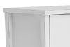
White


Verve Bedroom and Gavardo Dining
The versatility of white makes it an ever-popular neutral, which works well with any style and space. Embodying purity, innocence, and new beginnings, white creates a sense of spaciousness and organisation, stimulating creativity and refreshing the mind. White walls, ceilings and furniture are common choices, making spaces appear larger, brighter, and cleaner. Physically, white enhances focus and memory but can cause a blinding sensation if too bright. It’s important to balance white with deeper colours and interesting textures to prevent the room from feeling sterile or harsh.
Grey

Pictured: Neo Bedroom and Oaka Dining
Grey, a popular neutral, is associated with self-restraint and sleek sophistication. It exudes a calming, unemotional effect and serves as a backdrop that enhances other colours when used in combination. It pairs well with brighter colours like yellow, pink, or blue to add sophistication without overwhelming the atmosphere, but can dampen energy and appear depressing if overused. Designers often incorporate grey accessories and textiles rather than using it on walls, especially in spaces lacking natural sunlight.
Black

Pictured: Marlborough Dining and Bronte Bedroom
Black is often associated with sophistication, elegance, and power. When used sparingly, black can add depth and contrast to a room, making other colours and elements pop. Consider incorporating black in small doses through accent pieces like furniture, lighting fixtures, or decorative accessories to create visual interest and focal points. Additionally, black can be used to create a sense of intimacy and cosiness in larger spaces when used on walls or as part of a colour scheme. However, it's essential to balance black with lighter colours to prevent a room from feeling too dark or oppressive. When used thoughtfully, black can add a sense of sophistication and refinement to any interior design scheme.
Brown

Pictured: Camille Chair/Marlborough Bookcase and Larry Bedroom
Brown is often associated with stability, warmth, and earthiness. It can evoke feelings of comfort, security, and connection to nature. Lighter shades of brown, such as beige or taupe, can provide a neutral backdrop that complements a wide range of colour palettes and styles. Consider using light brown tones for walls, flooring, or larger furniture pieces to create a sense of warmth and serenity in a room. Darker shades of brown, such as chocolate or espresso, can add richness and depth to a space, making them ideal for creating a sense of luxury and sophistication. When using brown in interior design, consider incorporating natural materials like wood, leather, or stone to avoid feeling too drab and create an earthy environment that feels grounded and timeless.
Choosing the Right Colours for your Space

Once you have a vision in mind, turn to the colour wheel to learn how different colours relate to each other and work together. For example, if you've decided on green for your living room, you can create a cohesive look by using variations of green along with neutral accents like beige, black, or white.
Alternatively, you can explore complementary colours, which are found opposite each other on the colour wheel. Pairing green with its complementary colour, red, creates a visually pleasing contrast.
For a more adventurous approach, consider analogous or triadic colour schemes. Analogous colours sit next to each other on the colour wheel and create a harmonious, cohesive look. Triadic colours are evenly spaced apart and form a triangle on the wheel, offering a dynamic and balanced palette.
Neutral colours such as white, beige, and grey are often used as a backdrop in interior design. They provide a sense of balance, simplicity, and versatility, allowing other colours and elements to take centre stage. Consider using neutral tones for walls, flooring, and larger furniture pieces, then layering in pops of colour through accessories and decor for visual interest.
Other Factors to Consider
The Impact of Light
Light plays a crucial role in how we perceive colour. Natural light can enhance the vibrancy of hues, while artificial lighting can alter their appearance entirely. Understanding how light interacts with colour is essential for creating dynamic and multi-dimensional spaces. By strategically placing light sources and selecting appropriate colour palettes, you can manipulate the ambiance of a room to suit specific purposes and moods.
Layout and Flow
The spatial arrangement of furniture, architectural elements, and circulation paths can also greatly impact how we experience a space. An open and airy layout with clear sightlines can foster a sense of freedom and expansiveness, promoting feelings of relaxation and calmness. Conversely, a cluttered or cramped layout may evoke feelings of stress or unease. When designing an interior space, it's essential to consider not only the colour palette and lighting but also the layout and flow to create environments that support well-being and enhance the overall quality of life.
Colour psychology is a powerful tool in interior design, allowing us to craft environments that are not only visually stunning but also emotionally resonant. By understanding the psychological effects of colour and how it interacts with light and space, we can create harmonious interiors that enhance well-being and are truly a delight to live in.